
iOS Scholar's Blog
iOS Development Tutorials, Tips & Tricks and more
~~~~~~~~~~~~~~~~~~~~~~~~~~~~~~~~~~~~~~~~~~~~~~~
iOS 7 Design Themes - Description/Explanation for iOS Developers
Clarity, Depth and Deference
iOS 7 brings a lot of changes in not just the way Apple mobile devices look, but also how they work. Understanding the source/cause behind a change, makes it easy to understand the intent and also the future direction. As iOS developers, it’s important for us to understand this intent which entails the future direction.
WWDC sessions give a great insight into this philosophy behind the changes. The developers give a lot of examples to explain the design themes. Here is a quick description and explanation of design themes.
Design Themes
Clarity
The rules of thumb (sort of) are:
1. Applications should be Clear and easy to use.
2. Strip away the irrelevant and unimportant information.
3. Focus on what’s is really important to the user.
For e.g., focus in mail is on the content and pictures. I liked the way they explained this from the beginning - a clean sheet. The mail content is most important, then comes who send it etc.
The design should make it clear how a user uses it. The subtle highlight achieved from the different tint color for the buttons, which is enough to compensate for the missing heavy, bevelled controls is just one example.
Deference
The dictionary says, deference means polite submission and request.
Interesting choice of word for the design theme indeed.
This iOS 7 design theme entails giving first class citizenship to the content - that’s what the users care for most. It’s like deja vu. I’m having flash backs of my Object Oriented Programming notes saying - “Data gets the first class status in Object Oriented Paradigm”. It seemed so obvious - not the algorithms but the data itself should be important… and now again.. Not the ornamentation but the content itself should be highlighted.
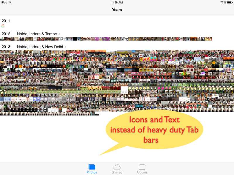
They’ve given a lot of examples from the built in applications UI. They did away with a lot of ornamentation which they claim was distracting. Borders, heavy Buttons, shadows etc.
In the weather app - the background which is indicative of the weather condition - fills the screen - runs from edge to edge and even behind the status bar. In the photos app, the crisp clarity of thumbnails, even in the moments view, showcases how absence of borders is helping to focus on user content - the photos.
Depth
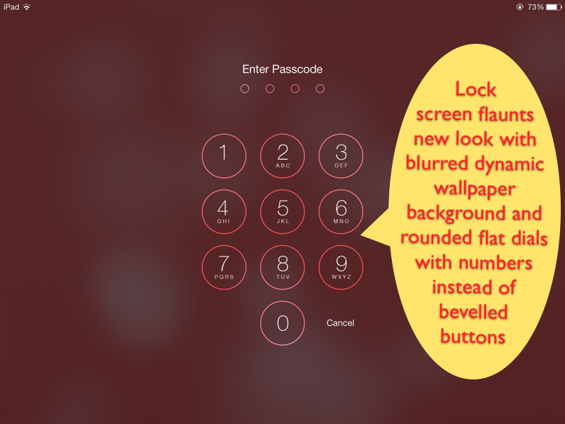
So you think the iOS 7 UI was a little flat without all the bevels and shadows. Apple seems to have been wanting to compensate for all the lost “un-flatness” and some more, by saying Let’s go 3d.
Applications in iOS 7 makes extensive use of
1. Blurring transparent layers.
2. New mechanisms like dynamics and motion effects, to build rich three dimensional experience. The examples shown for this include the home screen - icons on a different layer from the wall paper - which appears to be moving below the icons, if you move the device.
Apple engineers are claiming that using layers in an applications - a lot of meaning can be conveyed. They are showing control center which gets new look depending upon the application user was using when control center was summoned.
It does look awesome - However, I’ve not seen applications making use of layers to convey meaningful design yet, but off course the experience is rich.
The lock screen below is showcasing all that it would unlock. Rich User experience, subtle controls, and more focus deferred to the first class citizen of your iPad - your content.
© 2013, UV Associates
All rights reserved


